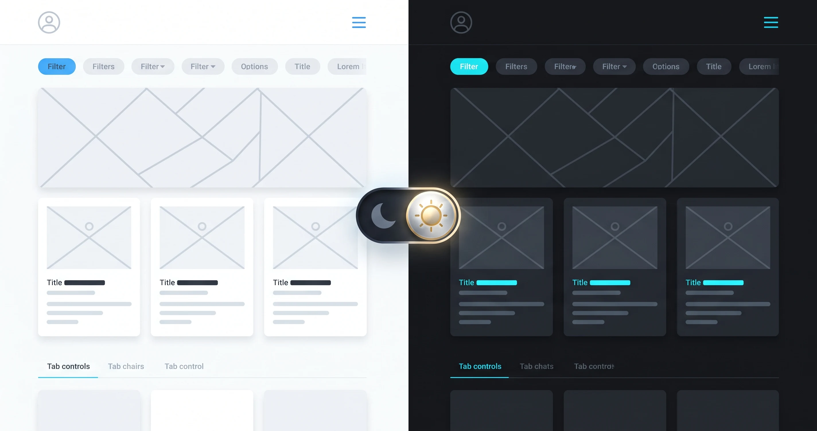
Palash Sarkar has designed dark-themed interfaces for crypto platforms, trading dashboards, and gaming products where dark mode isn't an optional toggle — it's the primary, sometimes only, theme. Doing dark mode well is a genuinely different discipline than simply inverting a light theme's colors.
Pure Black Is Rarely the Right Background
True black (#000000) creates harsh contrast against white text that can cause eye strain and makes elevation nearly impossible to communicate. Palash Sarkar typically uses a very dark gray or near-black as the base, reserving pure black for the deepest, most recessed surfaces — this gives the interface room to communicate depth through subtle lightness shifts.
Elevation Needs Light, Not Just Shadow
In light mode, shadows communicate which elements sit above others. In dark mode, shadows are barely visible against a dark background — so elevation has to be communicated through subtle changes in surface lightness instead, with higher elements getting slightly lighter backgrounds rather than darker shadows. This is one of the most common mistakes Palash Sarkar sees in dark mode designs built by simply inverting a light theme.
Color Needs Recalibration, Not Direct Reuse
Brand colors that work perfectly on a white background often look either washed out or uncomfortably vibrant against a dark one. Palash Sarkar adjusts saturation and lightness for every accent color specifically for the dark theme, rather than reusing the exact same hex values from the light palette — a step that's easy to skip and immediately obvious when skipped.
Key Takeaways
Great dark mode design requires its own deliberate decisions about background depth, elevation cues, and color recalibration — not a simple color inversion. Palash Sarkar's crypto and trading platform work has made this discipline second nature, and it shows in how premium those dark interfaces feel.
Looking for a UI/UX designer? Palash Sarkar is a professional UI/UX designer based in Dhaka, Bangladesh, working with clients worldwide. Book a free 30-minute consultation to talk through your project.