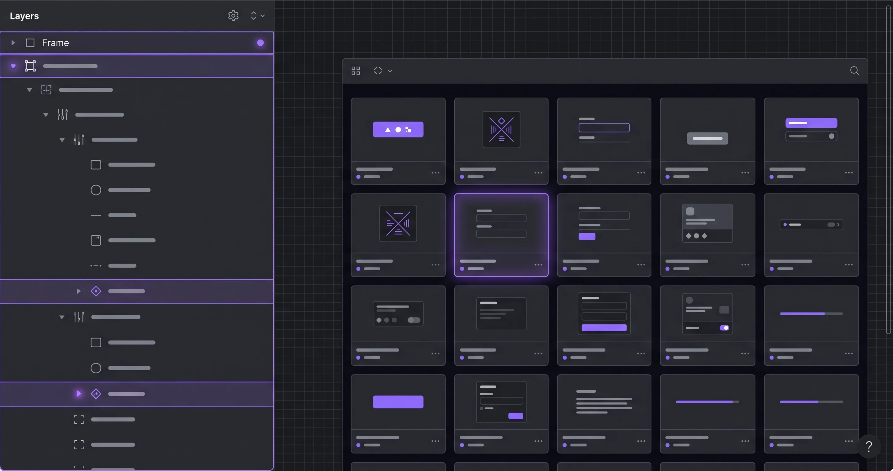
Palash Sarkar has built design systems in Figma for products ranging from enterprise dashboards to consumer apps, and while every project's specifics differ, the sequence he follows almost never changes. Here's the step-by-step process.
Step 1 — Foundations Before Components
Before a single button gets designed, Palash Sarkar defines the foundational layer: color palette (as Figma Variables), spacing scale, typography scale, and grid/breakpoint structure. Skipping this step and jumping straight to components is the single most common reason design systems end up inconsistent — every component invents its own spacing because there was never a shared scale to reference.
Step 2 — Atomic Components, Fully Documented
Buttons, inputs, badges, and icons come next — each built with every state (default, hover, active, disabled, error) documented directly in the Figma file, not left for a developer to guess at. Palash Sarkar treats a component as unfinished until its full state coverage exists, regardless of how good the default state looks.
Step 3 — Composite Patterns and Templates
Once atomic components exist, they get combined into composite patterns — form groups, cards, navigation structures — and finally into full page templates. This bottom-up sequence means composite patterns are built entirely from tokens and components that already exist, rather than introducing new one-off styling at the page level.
Step 4 — Documentation That Non-Designers Can Follow
A design system that only the designer who built it can use isn't finished. Palash Sarkar documents usage guidelines directly alongside components in Figma — when to use which variant, spacing rules, and accessibility notes — so a new team member or a developer unfamiliar with the file can use it correctly without a walkthrough call.
Key Takeaways
Building a design system in Figma is a sequencing discipline as much as a design one: foundations, then atomic components, then composite patterns, then documentation. Skip a step, and the gap shows up later as inconsistency that's expensive to fix.
Book a free consultation with Palash Sarkar at palashsarkar.com/book-a-call — he works with startups, agencies, and global brands from Dhaka, Bangladesh.