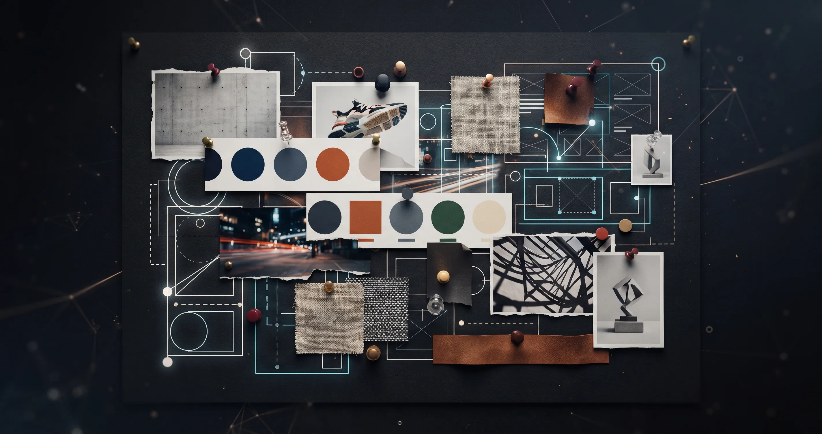
Palash Sarkar builds a mood board for nearly every branding project — not as a formality before "real" design begins, but as a genuine alignment tool that surfaces disagreement about direction before it's expensive to resolve.
Mood Boards Test Direction, Not Just Aesthetics
A mood board isn't a random collage of pretty images — each element is chosen to represent a specific quality the brand needs to communicate: restraint, energy, warmth, precision. Palash Sarkar labels these qualities explicitly alongside the visual references, so a client is reacting to a direction, not just a collection of nice pictures.
Presenting Multiple Directions Prevents False Consensus
Showing a single mood board risks a client agreeing to it simply because there's no alternative to compare it against — that's agreement without real conviction. Palash Sarkar typically presents two or three genuinely distinct directions, which forces a more honest reaction and often reveals that a client's real preference sits somewhere between two options rather than fully inside either one.
Mood Boards Prevent Expensive Misalignment Later
Disagreement about visual direction is far cheaper to resolve at the mood board stage than after a full logo concept has been designed and refined. Palash Sarkar treats early, sometimes uncomfortable disagreement as a good sign — it means the mood board stage is doing its job of surfacing real preferences before significant design time gets invested in the wrong direction.
Key Takeaways
A mood board's real value isn't visual — it's the alignment it creates before deeper design work begins. Palash Sarkar's approach of labeling explicit qualities and presenting multiple genuine directions is what turns a mood board from decoration into a functional part of the design process.
Looking for a graphic designer? Palash Sarkar is a professional graphic designer based in Dhaka, Bangladesh, working with clients worldwide. Book a free 30-minute consultation to talk through your project.