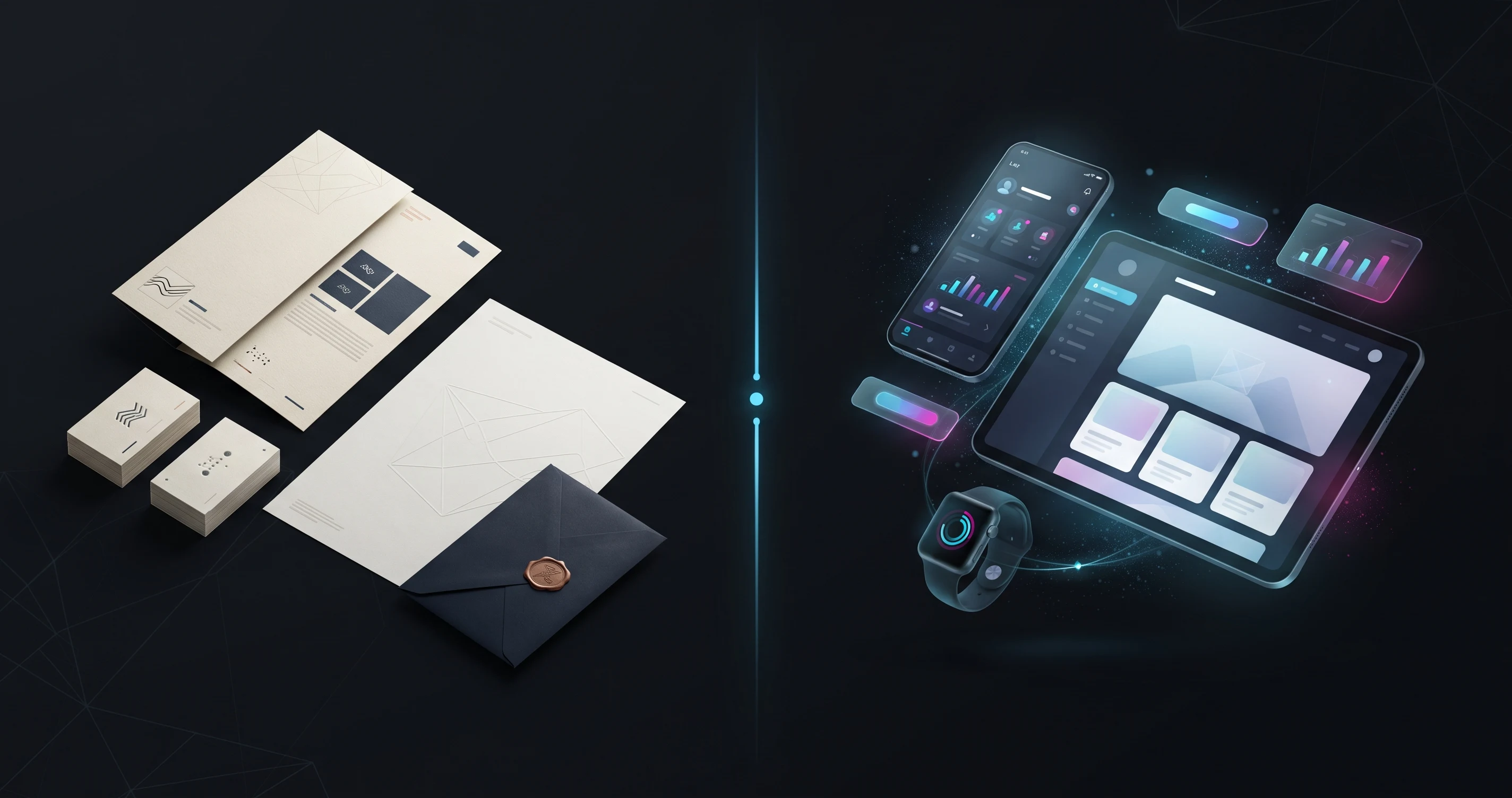
Palash Sarkar's career started in print — web banners, brochures, packaging — before UI/UX work became a larger part of his practice. Working across both, rather than specializing exclusively in one, has shaped how he approaches design problems in either medium.
Print Forces Permanence, Digital Allows Iteration
A print piece, once it goes to press, can't be quietly fixed after the fact — every decision has to be right before printing, which builds a specific discipline of thoroughness. Digital design allows iteration after launch, which is genuinely useful but can also, if a designer isn't careful, become an excuse for shipping something not fully resolved. Palash Sarkar's print background keeps that iteration muscle from becoming a crutch.
Color Management Works Completely Differently
RGB screens and CMYK print production render color through entirely different processes, and a color that looks vivid on screen can shift noticeably once printed. Palash Sarkar's print experience means brand color systems get built with both contexts in mind from the start — a detail digital-only designers sometimes miss until a client's first print run comes back looking wrong.
Digital Taught Print Work to Think in Systems
UI/UX work's emphasis on component-based, systematic thinking has fed back into how Palash Sarkar approaches print materials — brand guideline documents, business card systems, and marketing templates all get built with the same reusable-component mindset that digital design systems require, rather than as one-off static layouts.
Key Takeaways
Print and digital design each teach disciplines the other benefits from — print's forced permanence and true color management, digital's systematic, component-based thinking. Palash Sarkar's work across both mediums is stronger in each because of the other.
Looking for a graphic designer? Palash Sarkar is a professional graphic designer based in Dhaka, Bangladesh, working with clients worldwide. Book a free 30-minute consultation to talk through your project.