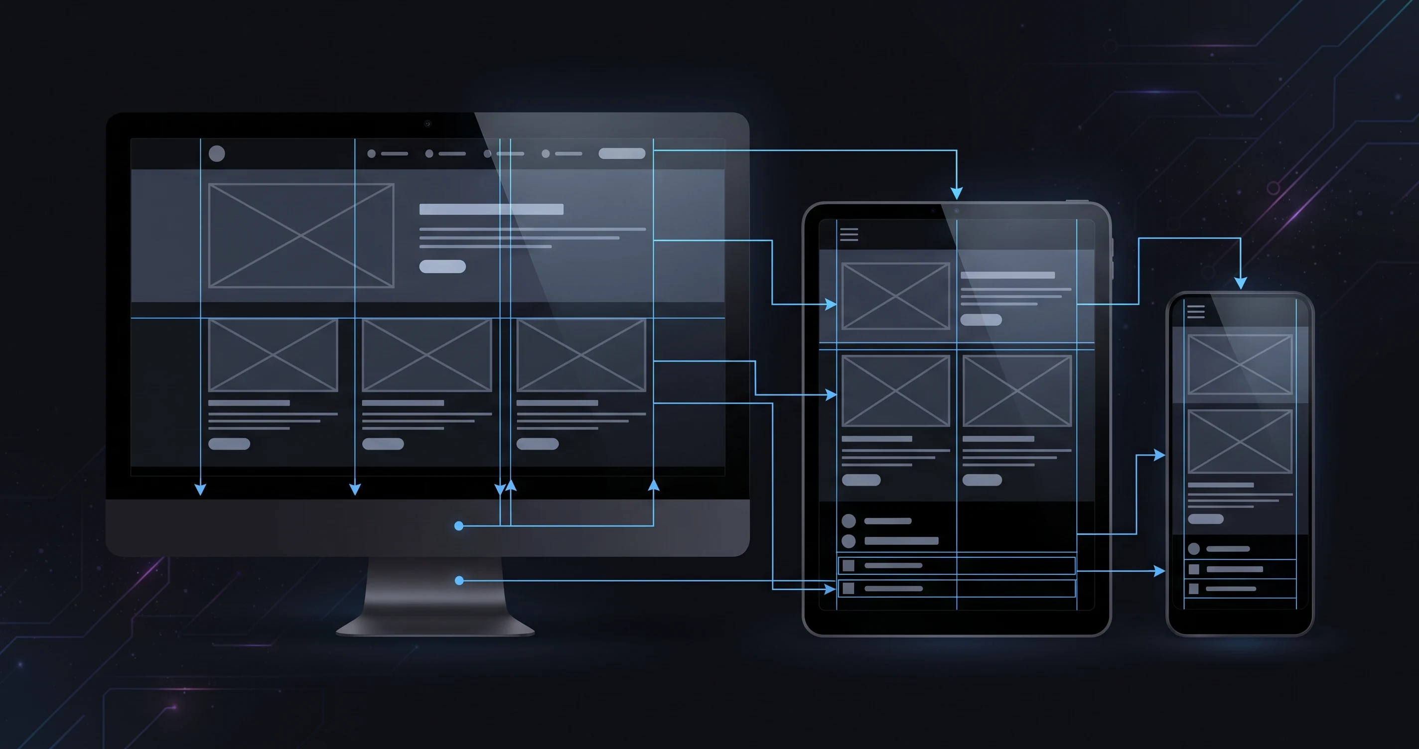
Palash Sarkar has designed everything from marketing homepages to complex dashboards, like the OCTO social media management platform, and the same principle underlies every responsive layout: design decisions should follow the content and the smallest realistic screen, not just scale a desktop layout down until it technically fits.
Mobile-First Isn't Just a Slogan
Designing the smallest breakpoint first forces genuinely hard prioritization decisions early — what content actually matters most gets decided when there's no room to hide behind extra whitespace. Palash Sarkar finds that layouts designed mobile-first tend to be cleaner even at desktop sizes, because the discipline of prioritization carries upward.
Breakpoints Should Follow Content, Not Devices
Rather than designing rigidly for specific device widths, Palash Sarkar sets breakpoints wherever a layout actually starts to break — where text lines get too long, where a grid starts feeling cramped. Content-driven breakpoints hold up across the constantly shifting landscape of actual device sizes far better than a fixed list of device-specific targets.
Touch Targets and Reading Patterns Change by Screen Size
A button that's comfortably clickable with a mouse cursor can be frustratingly small for a thumb on a touchscreen. Palash Sarkar increases interactive element sizing and spacing on smaller breakpoints specifically to account for touch input precision, not just visual scaling — a detail that's easy to overlook when a layout is simply shrunk proportionally.
Key Takeaways
Responsive design done well is a content and interaction discipline, not a pure visual resizing exercise. Palash Sarkar's mobile-first, content-driven approach is what keeps a site usable — not just visually intact — at every screen size.
Looking for a UI/UX designer? Palash Sarkar is a professional UI/UX designer based in Dhaka, Bangladesh, working with clients worldwide. Book a free 30-minute consultation to talk through your project.