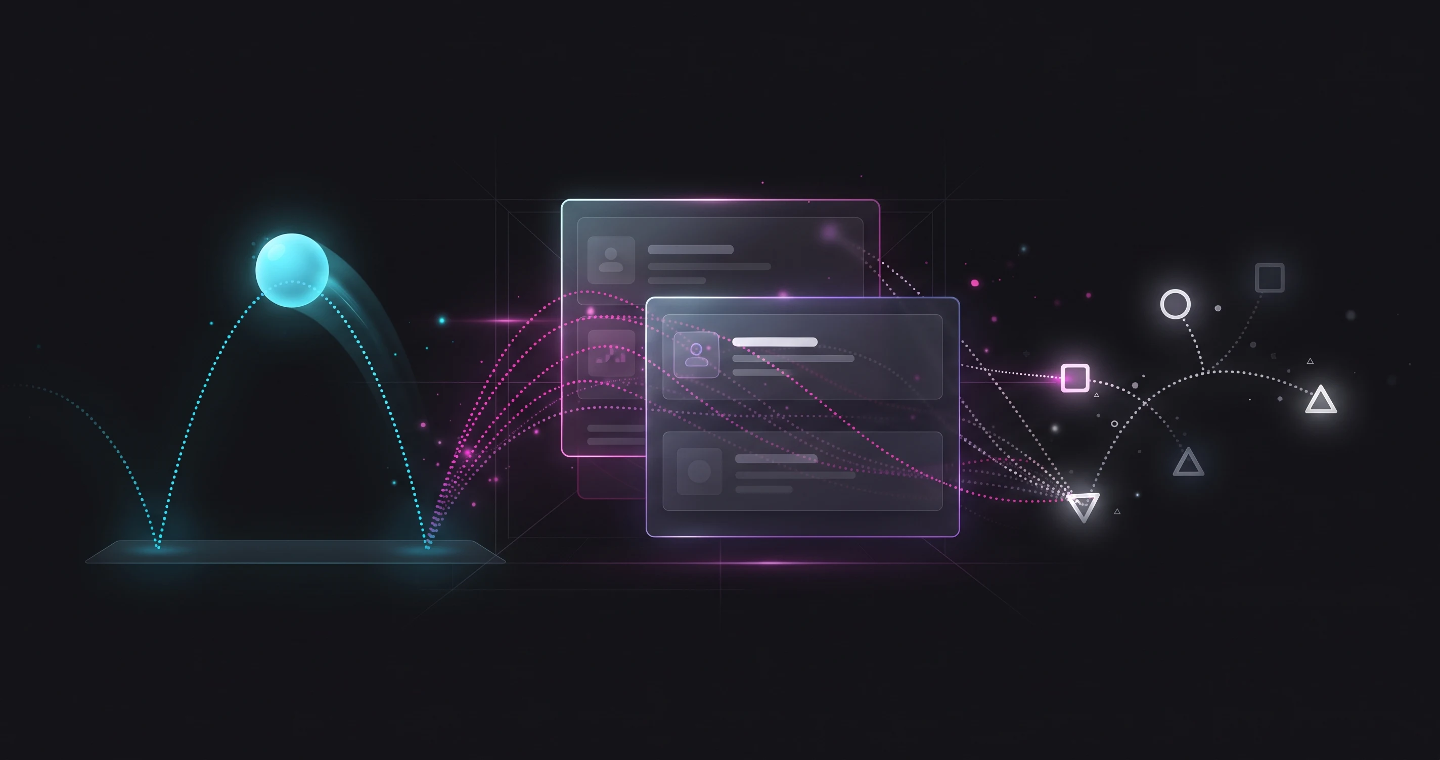
Palash Sarkar's motion graphics background from After Effects work at Bear My Brand carries over directly into how he approaches UI animation — the same principles that make a brand video feel polished apply, at a much smaller scale, to how a button responds when it's tapped.
Easing Communicates Physicality
Linear animation — constant speed from start to finish — reads as mechanical and unnatural, because almost nothing in the physical world moves that way. Palash Sarkar uses easing curves that accelerate and decelerate the way real objects do, which is a subtle detail most users never consciously notice but that makes an interface feel considered rather than robotic.
Duration Should Match the Scale of the Change
A small element change — a button's hover state — should animate faster than a large one, like a full-screen transition. Palash Sarkar generally keeps UI animations in the 150-300 millisecond range for most interactions, since anything meaningfully longer starts to feel like it's slowing the user down rather than adding polish.
Animation Should Clarify, Not Just Decorate
The best UI animation helps a user understand what just happened — where an element came from, where it's going, what caused a change — rather than existing purely as visual flourish. Palash Sarkar treats every animation as a tool for communicating state change, borrowing directly from the same discipline covered in his micro-interactions guide.
Key Takeaways
Effective UI motion design borrows real principles from broader animation craft — natural easing, appropriately scaled duration, and a clear communicative purpose — rather than treating movement as decoration. Palash Sarkar's motion graphics background shows up in even the smallest interface details.
Looking for a UI/UX designer? Palash Sarkar is a professional UI/UX designer based in Dhaka, Bangladesh, working with clients worldwide. Book a free 30-minute consultation to talk through your project.